
The Banner Nobody Wanted: +37% Ad Revenue
I proposed a home screen concept with an ad banner at the top. The CPO and CTO said, “We’re definitely not doing that.” Today it’s the second-biggest ad format in the product by revenue.
Context
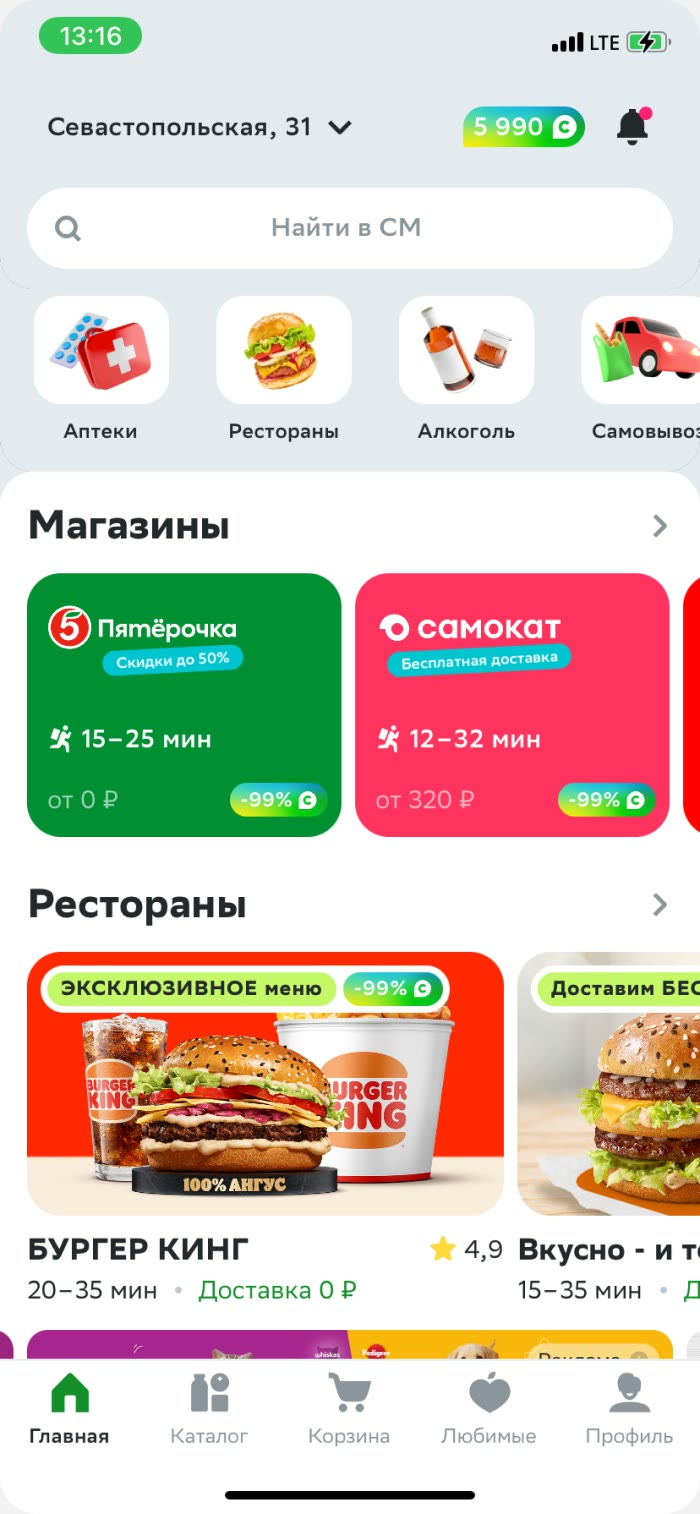
By mid-2023, Kuper’s home screen had stopped scaling. The service was growing non-food and onboarding new retailers, but new verticals were simply invisible because of how the carousel worked. The screen was long, yet scrolling gave you almost nothing new. The business wanted to stop being “the service that only delivers groceries and takeout,” and the home screen was saying exactly that.
Marketing was a separate problem. Our own promos, the loyalty program, and advertiser campaigns were scattered across the product in small banners. There was no single place that instantly read as “this is what matters right now.” Someone would see a Kuper promo somewhere outside the app, open it — and not find it.
My role
At the time, I was just moving into the lead role. My scope was the second half of the funnel: cart, checkout, delivery terms.
I was still doing a lot of hands-on work too: while the home screen designer was on sabbatical, I was helping with its design.
The concept
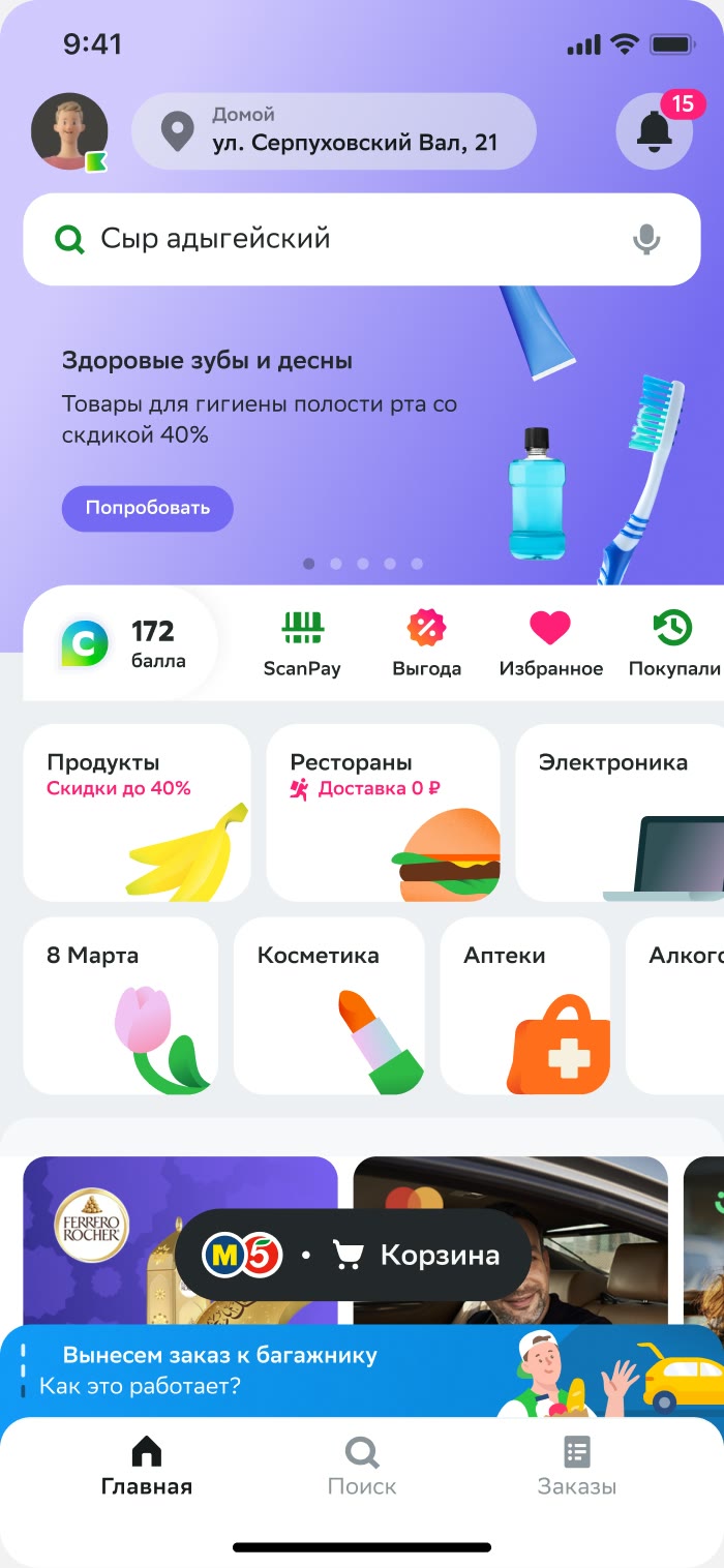
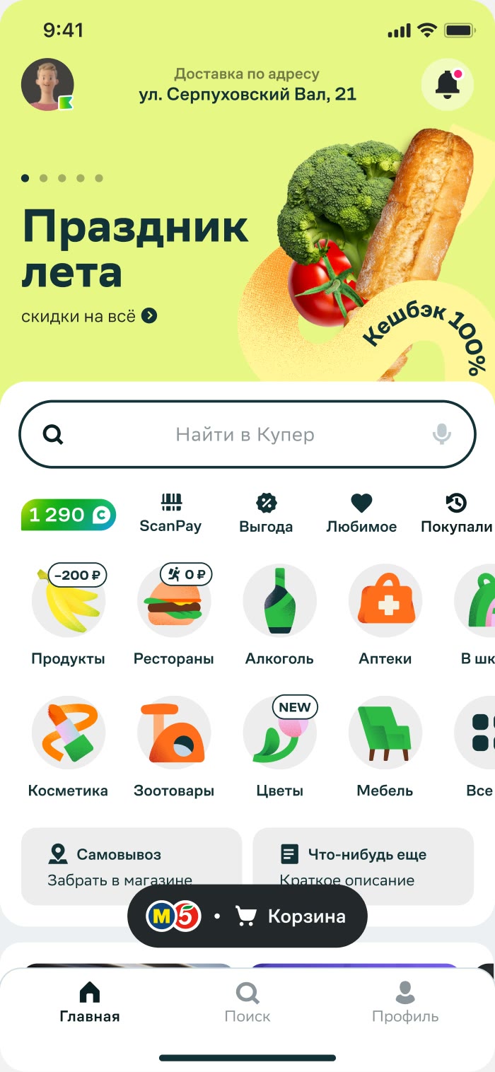
The task I got was to show users they could shop across different categories, and that we had a lot of them.
I didn’t stop at that task — I drew a concept for the entire home screen. It had been bugging me for a long time, and I wanted to rebuild it, both product-wise and visually. I wanted to push discovery and window shopping in general. I also rethought how we did advertising and marketing on the home screen: I felt it should be bold and eye-catching, not tucked away in small banners across the product.
“Definitely not”
I showed the concept to designers, PMs, different teams. Reactions varied, and the most controversial part, as expected, was the ad format on the first scroll. The key presentation was a meeting with the CPO and CTO.
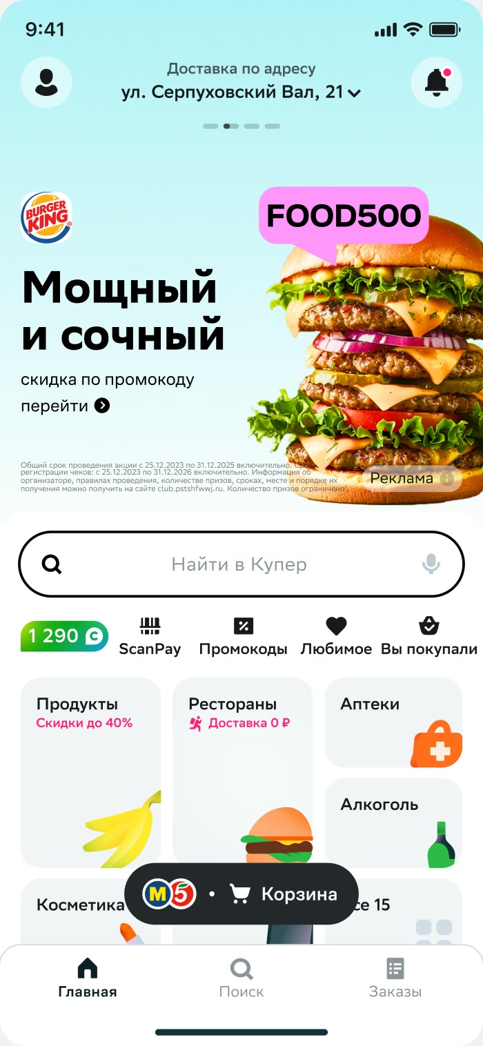
At that meeting we went through my approach and ideas for the home screen: some landed better than others. I argued for the banner. Users were already used to scrolling — a big banner at the top doesn’t block the screen, it sets the tone: “there’s stuff to look at here.” And it wasn’t just about ads. It was a single home for our own promos and loyalty program, which the product was missing. I didn’t convince them: I was told there would definitely be no ad banner on the first scroll.
After the presentation, the concept stayed alive within the team. I don’t know exactly what happened next, but a couple of months later the first-scroll ad banner showed up in the backlog as a priority task.
A banner that can’t be ruined
Once the banner became a real task, the main risk shifted. The question was no longer whether to build it, but what it would turn into once dozens of advertisers and campaigns started flowing into it at once.
I insisted that only consistent, moderated content should go into the banner: it was our flagship spot and, essentially, the face of the service. The design director, who had just joined, proposed how to guarantee that technically: instead of uploading the banner as an image, assemble it on the front end from parts via an admin panel. Fixed grid, our system font, character limits, backgrounds from a set palette, a rendered CTA button. One promo per banner. The ad tools team wrote a creative guide: photo style, angles, logo rules.
All of design had to defend this approach together. Ad PMs and sales found it too rigid — their interest was selling the space fast and without restrictions. Engineering found it too expensive.
We didn’t back down. There’s physically no way to push custom creative into the banner, and the format still runs on this mechanism after several iterations.
Result
Today it’s the second-biggest ad format in the product by revenue, and the single entry point for internal campaigns.
+37%
Ad Revenue
From hero banner
−0.8%
GMV
The revenue covered that almost 3.5 times over
Beyond the banner
The banner was just one piece of rebuilding the home screen. In parallel we worked on categories, widgets, retailer cards, and a recommendation feed — and soon the home screen itself became part of my scope. Over two years we rebuilt it completely, both conceptually and tool by tool. The home screen stopped being a directory of stores: now it works for people who come for a specific retailer, for people looking for a product, and for people who just want to browse.
What I’d do differently
I came to the meeting with the CPO and CTO with a concept and arguments — so the debate came down to opinions. I should have come with a test. Not interviews: people would predictably say ads are annoying. A behavioral test on a prototype, showing that the banner doesn’t get in the way of finding stores and restaurants. Then the decision might have happened in that same meeting, not a couple of months later.